CARNEGIE MUSEUM LECTURE

My students, either from a literature or writing class at the University of Pittsburgh, begin to gather inside the entrance to the Carnegie Museum of Art. Once we are assembled, I ask how many of them have been here recently. A smattering of hands goes up. I ask how many of them have been here on a school visit. More hands go up. Did it teach you anything? I ask. No hands go up. Right then, I smile — let’s begin.
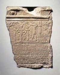
They follow me up the long steps, through the first room of the Scaife Gallery, all the way to the back, where we stop next to an ancient statue whose immediate charm is a pair of very shapely buttocks. The students think we’re going to begin here, but no; this is about reading and writing, I tell them: where do you see writing? They look around and someone will spot it; the small piece of hieroglyphics on the wall behind me.
It doesn’t matter whether they are a writing student, and therefore in the business of transcribing thoughts to paper, or a literature student, whose concern is in reading texts — all texts. This is where it starts, I tell them: all writing is language given shape. In its earliest iteration, meaning was hammered into stone in the form of coded sets of pictures. It is not yet an alphabet, but we read it nonetheless. This is what we will spend the next hour doing, only we’ll be doing the reverse of what they are used to: we will look at the images before finding words for them.
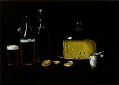
We move a short way into a room hung all over with paintings in ornate frames. Our second top is Albert Francis King’s still life, “Late Night Snack.” We’re going to go from dead easy to very hard in terms of images to interpret, but they don’t know this yet. What is this painting of? I ask. I don’t expect them to answer right away; they think it’s a trick question. Once someone starts to state the obvious: a jug, some bottles of beer, a hunk of cheese…. I push the point. Yes, but how do you know that? The reflection on the glass, they will say. How do you know it’s beer? The froth, they will reply. Why does that say beer? I ask. The answer is because we all know that froth is a property of beer: it is something the artist has utilized as a shortcut to render a very specific liquid. What else about it lets you know it is beer? I ask. Well, the color, for one thing, and the shape of the bottle.
Exactly. This, I tell them, is what writers do: we utilize just the right detail about an object to suggest it to our minds; we only need mention a few words to produce detail as vivid and lifelike as this painting in our reader’s heads. I ask them to count how many surfaces they can see here: glass, china, earthenware, wood, cheese, biscuit, liquid, etc. I ask them if these objects look three-dimensional. I show them that a single element has been employed to make this so: light. I ask them where the see light, and they all say the reflection in the glass. But there are two parts to light: where it hits a surface, and where it doesn’t. Shadow is just as important in order to render an object realistically.
What can we learn from this? That when writing, we need to pay as much attention to where our words are on the page as where they aren’t, especially in poetry. I remind them that though it is far more subtle, they need to master shadow in their writing in order to make their writing pop. (Once back in the classroom, we will look at a few poems to see where this happens, and I ask them to find the where the light hits the poem; where the shadows fall. This reinforcement takes them further as astute readers and writers than anything I know.)
Finally, I ask for suggestions as to what the title of such a painting might be. Beer and Cheese, they say. As a title that would be accurate but awfully dull, wouldn’t it? Yet a lot of the students use this approach in their own work. How about if the painting told a story? What if it was not a still life, but a narrative? I have had students who have never encountered the painting before guess correctly: “Late Night Snack.” Bingo.
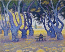
We move on to Signac’s “Place Des Lices, Saint Tropez,” which is composed on many tiny dots of color — obviously very different to what we’ve just seen. The point here is not to depict something with photographic realism, but to experiment with how the eye sees to begin with. Even though he is using dots, we can still tell what the subject is; our minds decode this information and it still makes sense. What this painting is doing, I remind them, is merely being an old-fashioned version of a TV screen.
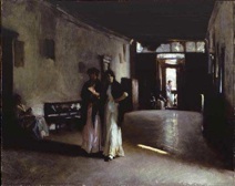
John Singer Sargent’s “Venetian Interior” does a similar thing. We start out viewing it from a distance; I ask the students what is happening in the painting and they point out two woman are walking in a hallway. True; but what gives it resonance? What makes it feel real? I ask. The flash of light on the floor, they reply. Why is that? Because it is a subtle detail that we recognize as pertinent to the real world, a clue that informs us there is a solid floor to walk upon. The women’s bodies, too, seem like they have weight, have skeletons, and suggest conversation. Surely such a realistic portrayal must be executed with as much precision at the beer and cheese, no?
No. I have them come up close to see what Singer Sargent really did to make those details come alive: a big, fat globby splodge of paint. No precision at all. The lesson here is that we can suggest things in broad strokes, and they will work in a viewer’s (or reader’s) mind as long as they are the right details.
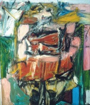
Next up is Willem DeKooning’s “Woman VI.” We also view this from a distance. It is a large painting, and the subject is unclear. I ask them what they think the title of this one might be. All sorts of answers come up — they are clearly guessing wildly. That’s having the cart lead the horse, I say. What if I told you the title was “Truckstop”? Ah yes! they exclaim — they can see the truck now. When what we are looking at is not immediately obvious, we rely on external sources to clue us in. A title, or words, can do that. I tell them the painting’s real title, and sure enough, the woman becomes visible.
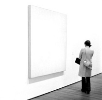
Then we stop in a doorway to view Robert Ryman’s “Issue” from as far away as possible. How many of you would walk right past this sort of thing? I ask them. Almost all of them agree that it is the sort of thing that makes them hate modern art. What is the point? they say — it’s just a white square. They feel conned by work like this, as if the artist is pulling a fast one over on them. There’s nothing clever about it, they remark; there is no subject.
But wait: there is, and it’s very clever indeed. It all depends on proximity. This piece is designed to force you to step closer; you have to bend to its will to satisfy your curiosity. We step up as close as we can get. What do you see now? I ask. They look intently: they know there must be something to spot. Sure enough, the answers start coming thick and fast: it’s not canvas! No: it’s aluminum. How can they tell? Ryman has left a scant 1/16th of an inch unpainted border around the whole thing. And look! The paint has been applied in careful horizontal strokes. Wow, that’s precision. But why go to the trouble? Because of how the students feel now: they feel rewarded by having looked and seen what they might have missed. Good advertising works like this too: it is capable of changing your opinion in a flash.
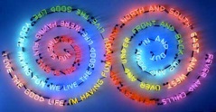
Finally, they are prepared for our last example. It is Bruce Nauman’s flashing neon sculpture “Having Fun / Good Life, Symptoms.”
First, we decipher what the words say, and note how they draw attention to opposites. This is much like Signac’s use of oppositional color dots. But the phrases feel shallow, pithy, empty; why has he chosen these words? We note that the whole thing is mesmerizing; it is as if a giant pair of eyes is staring at you.
But this isn’t about the words, not really. It’s about materials. What is it made out of? I ask. Neon. Where do we usually see neon being used? In signs for beer, sex shows, gambling venues, open signs. What do these things have in common? They are all “sin” commodities, generally sold at night — hence the neon, which only really works in the dark. Neon beckons and entices; it is a shortcut for a certain type of product, so whatever it’s selling has already been half sold. Now that we’ve thought about the medium, I ask them how it positions them, standing there looking at it. This is trickier. They are no longer merely viewers in an art museum; they are consumers: the medium — neon — has made them into potential customers of whatever message Nauman is selling. We’ve come full circle back to the ancient words scratched into stone: It’s not just about the words. The medium can indeed be the message after all.
The looks on their faces tell me they’ve literally seen the light.
© Micki Myers 2011
© Micki Myers 2013